Charting the Way:
Exploring three decades of Energy Transition.
Product Dynamic data visualization for the web.
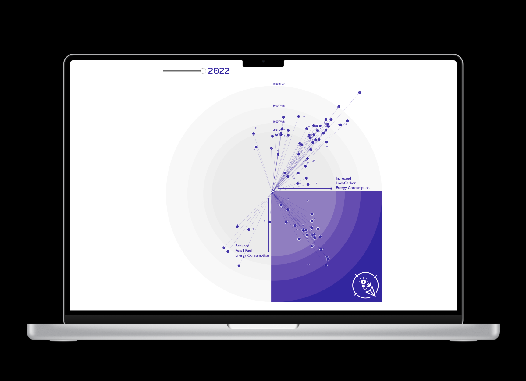
Content A comparison of the change in energy consumption by country from 1992 to 2022.
Tools
Visual Studio Code
HTML, CSS, D3
Adobe Illustrator
Excel
In 1992, the United Nations Framework Convention on Climate Change marked a pivotal moment by affirming the scientific consensus on the role of greenhouse gas emissions in global warming. This collective acknowledgment spurred action, culminating in the signing of the Kyoto Protocol in December 1997 by 192 state parties, committing to reducing greenhouse gas emissions. But how has this commitment translated into action?
This exploratory visualization traces the change in energy consumption since 1992, distinguishing between fossil fuel sources and low-carbon alternatives. It prompts us to consider whether our collective pursuit of transitioning to low-carbon sources aligns with the necessary momentum for meaningful change. Are we headed in the right direction?
The purpose of this project was to create a dynamic visualization that focuses on the direction of change in each country's energy transition rather than just the amount of energy consumed. This approach aims to foster a more balanced conversation about how each country is progressing individually and what this means for the collective efforts.
To achieve this objective, the design moves away from traditional renditions of time trends, like bar charts, and highlights the country’s energy consumption change as a radial line moving through time, akin to a compass .
Project Overview
“The ways in which we visualize data can profoundly influence our perception of the information, much like tone and punctuation affect our interpretation of written words.”
This project was a final deliverable for an academic course in the MFA in Information Design and Data Visualization.
